
First impressions are extremely important, and quite often, the first contact potential customers make with your brand or company is through your website’s homepage. But in order to keep your visitors moving down the sales funnel and eventually turn them into customers, you need to keep them engaged.
Website engagement is somewhat of a blanket term that encompasses all of the actions and accompanying metrics describing how your visitors are interacting with your website. For example, when tracking engagement, you’ll want to keep an eye on the frequency and duration of visits as well as how visitors found themselves on your website in the first place.
According to research, the average time on page across all industries is 54 seconds. In reality, however, your website only has a handful of seconds to capture your audience’s attention.
So, what contributes to optimal website engagement? There’s a number of different factors, such as relevant content (which corresponds with user intent), as well as the design and layout of the homepage itself. For example, 38% of visitors will stop engaging with a website if they find its content and/or layout unattractive.
To help you make your homepage more engaging, we’ll break homepage design down to its most important elements and see how each of those can be improved to keep your visitors interested. Keep on reading to find out more.
1. Homepage Animations
Our brains process images 60,000 times faster than text, which makes animation ideal for boosting website engagement. When used tastefully and without compromising the functionality of your website, animation can keep your visitors glued to your homepage. Not only does it look great, but it can also be used to make complex concepts and subject matter more appealing and easily digestible.
Also, animation goes a long way toward turning your visitors into customers. Conversation rates for companies that use custom visuals are reportedly 7x higher.
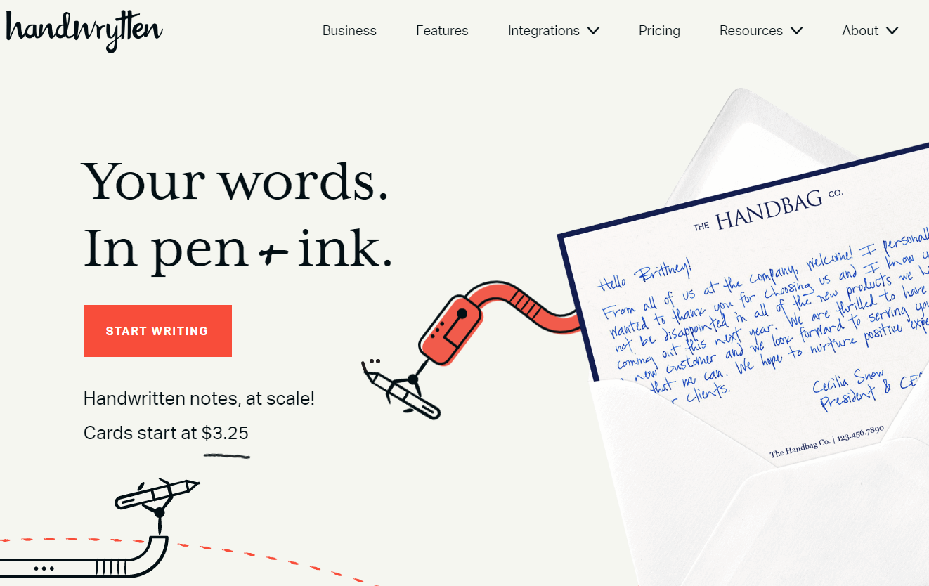
For example, Handwrytten has a beautiful homepage that shows animated robot hands using pens to create hand-written notes. That’s exactly what this company does – use custom-built robots to write notes using actual pens.
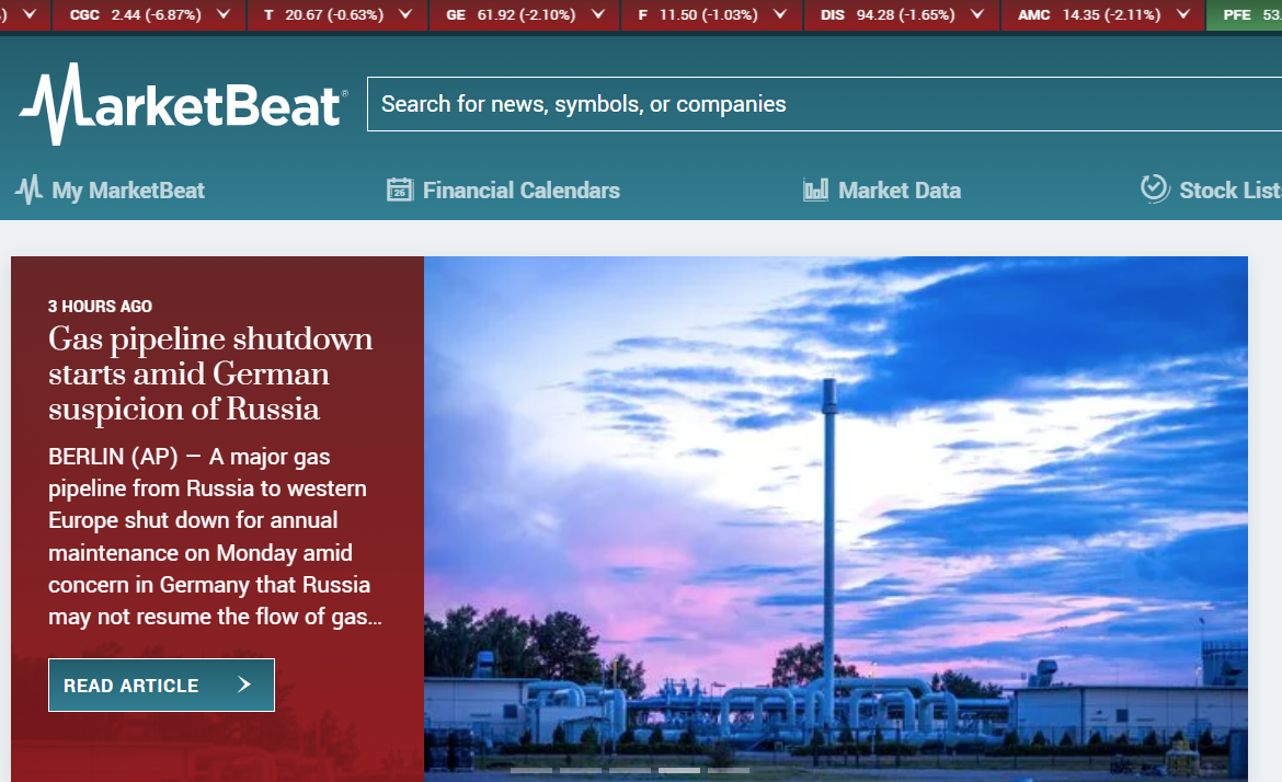
A good example of more subtle use of animation is the homepage for MarketBeat, which offers stock market calendars, market data, and relevant articles. They use animation in the shape of a tape at the top of the page that shows the latest prices for a number of different stocks.
Also, when you scroll down the page, the logo of the company shrinks to make room for content. Finally, there is the slideshow that displays the latest article they have published. All of these movements are very discreet, and they show how form can follow function while still remaining eye-catching and attractive.
2. Page Speed
The attention span of your customers and visitors in this day and age is notoriously short, which is why having a website that loads fast is crucial for user engagement.
According to research done by Google in 2018, the average mobile website took 15 seconds to load. That’s a lot, considering that the first five seconds of page-load time have the highest impact on conversion rates.
But perhaps we shouldn’t even be talking seconds here, because shaving off just a few milliseconds in page load time can have a significant impact on your sales figures.
For example, Amazon determined that every 100ms in added page load costs them 1% on sales. Just to put things in perspective, 1% of Amazon’s annual revenue is nearly $4.8 billion!
Poor page speed also affects user experience on your website, ranking, and bounce rates. Some of the most common ways to improve page speed include:
- Image compression – You can still have your high-quality hero images on your homepage by reducing their file size. You can compress using lossless compression, crop them, or use a lighter file format.
- Reduce the number of redirects – Every time you redirect to a page, the HTTP request lasts longer, creating a slower response.
- Enable browser caching – This saves copies of your website’s files, which makes it easier for the server to generate and display a page inside the browser.
- Use a CDN – Using a Content Delivery Network improves page speed because copies of your website’s static content are hosted and delivered from the nearest server.
- Remove non-essential plugins – Having too many plugins can make your website really slow, especially if they are outdated or if they pose a security threat.
3. Good Reasons to Stay On-Site
So, you have a fast-loading website that also has some nice visual elements, such as images, animation, or video, but your website still isn’t connecting with your visitors?
One of the reasons why this is happening might be that you’re not giving them enough reasons to stay, especially in terms of content. In order to capture your audience’s attention, your value proposition needs to be communicated in a clear and concise manner. That’s easier said than done, because you need to present your entire brand or company in two to three sentences.
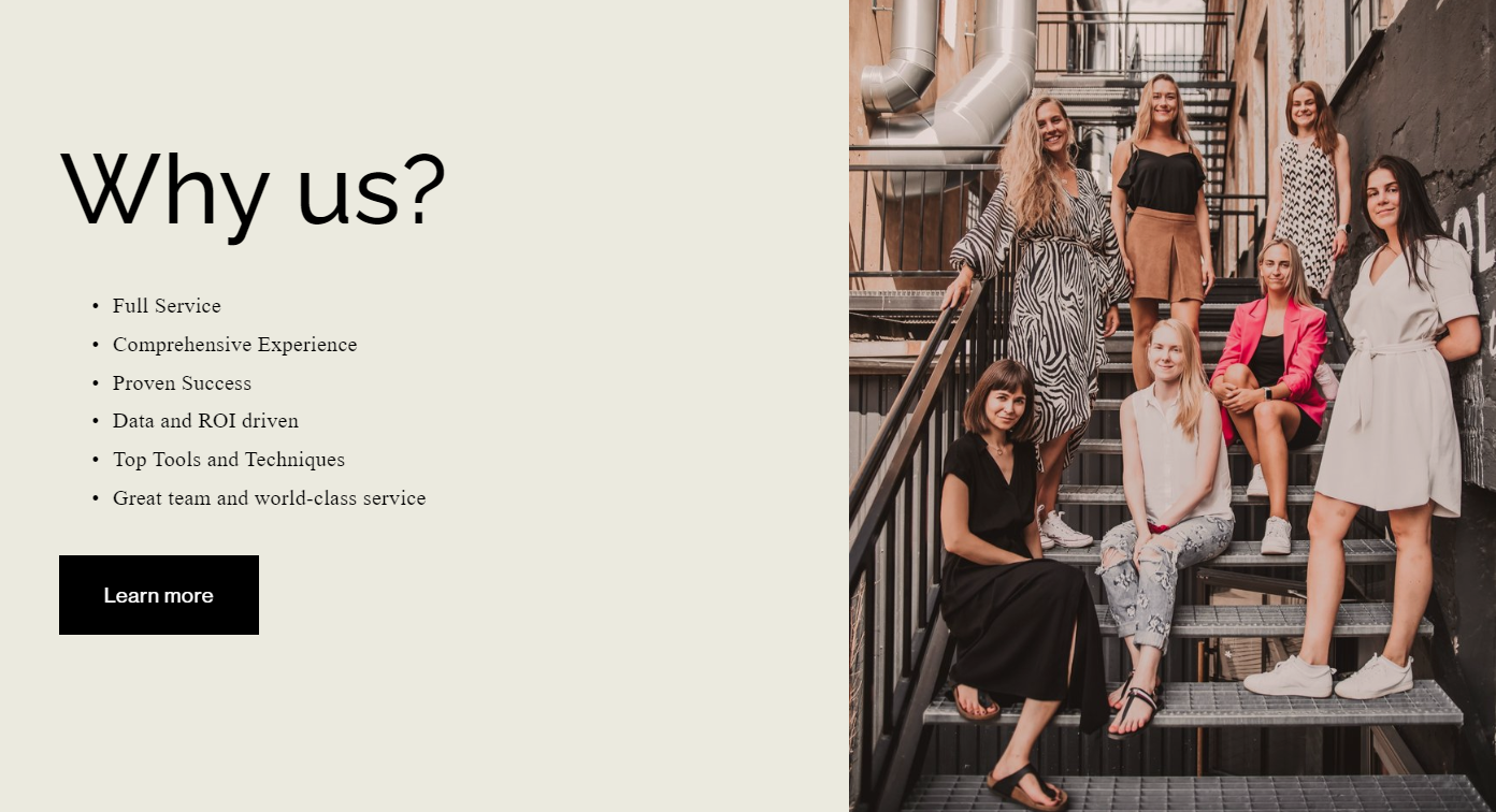
Take a look at how Digitarial Agency has decided to go for the direct approach in presenting its boutique marketing agency and services. The “Why Us” section of their homepage gives a pretty short but very detailed value proposition, including all of the most relevant reasons why a customer would want to opt for their services. And they do so in about 20 words or less, addressing the customers’ biggest pain points in a few seconds, while they still have their attention.
Source: https://www.digitarialagency.com/
4. White Space
White space is much, much more than a passive element of the page or simply a blank background.
For starters, white space makes your homepage design look clean, elegant, and more visually appealing. Also, it makes for better readability, which is crucial when you want to get your message across. By enabling your audience to scan your content, you will keep them on your website longer and reduce bounce rates.
According to research, white space helps improve comprehension by about 20% or so. By utilizing white space between paragraphs, sections, and text blocks, you make it easier for your visitors to know what they are looking at. In addition to that, when your calls-to-action are surrounded by white space, it makes them more visible and effective. And that will certainly affect your conversion rate in a positive way.
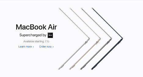
Apple is king when it comes to sleek design, and its homepage is no exception. There is very little here in terms of copy, but all the white space makes the page look really clean and draws the visitor’s attention towards the product – in this case, the new MacBook Air.
5. Present Complex Concepts in a Simple Way
Some concepts and processes are more complex than others, which requires brands and companies to showcase their products and services in a way that isn’t confusing or overwhelming. One of the most commonly used forms for making complicated subject matter simple is video.
According to statistics, as much as 60% of businesses use video as a marketing tool, and many of them use it on their homepage.
Explainer videos are usually the way to go here, but this hilarious Dollar Shave Club video uploaded in 2012 still reigns supreme in terms of introducing a new brand and having people raving about it.
Source: https://www.youtube.com/watch?v=ZUG9qYTJMsI
However, if video is not an option for you, you can still simplify concepts by breaking them down into simple, smaller steps.
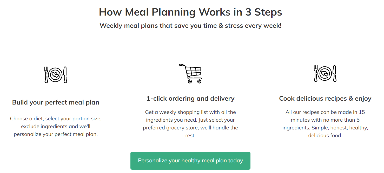
For instance, nutrition is a pretty complicated subject, but Ultimate Meal Plans make it as simple as possible in the “How Meal Planning Work in 3 Steps” section of their homepage. For those who want to create a meal plan, this step-by-step process covers everything from diet choice, portion size, and ingredients, to grocery shopping and recipes.
6. Visible Contact Details
Another way to boost website engagement would be to make your contact details, such as your phone number, email, and address, clearly accessible and visible.
Depending on the layout of your homepage, you could easily reach the “About Us” page through the navigation menu. You could display the same contact information in the footer of the page, as most brands do. This is also a good place for widgets or links to your social media profiles.
You could also put a chat box on your website and enable your customers to contact you that way. Regardless of the contact options you choose to go with, make sure that they are consistent across all of your social media platforms, your website, and third-party websites, such as your Google My Business listing.
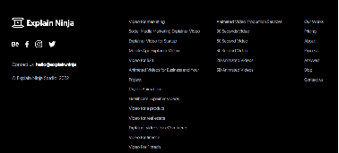
Explain Ninja’s homepage has their contact information listed inside the footer of the page, along with social media buttons, their sitemap, as well as links to their key services, which are explainer videos and animation for a variety of different industries.
7. Highly Visible CTAs
We have already touched briefly on this when we were explaining the use of white space, which is one of the ways of making your CTAs more visible.
Call-to-action buttons, when clearly visible, can help influence buyers to make a purchase or take any other action you want them to take, like giving a donation or subscribing to your email newsletter. The design of your CTA button should make it stand out from the rest of the page so that it grabs the viewers’ attention as they are scanning your homepage. The CTA copy should be clear and concise – you need to be straightforward when telling your visitors what action you want them to take.
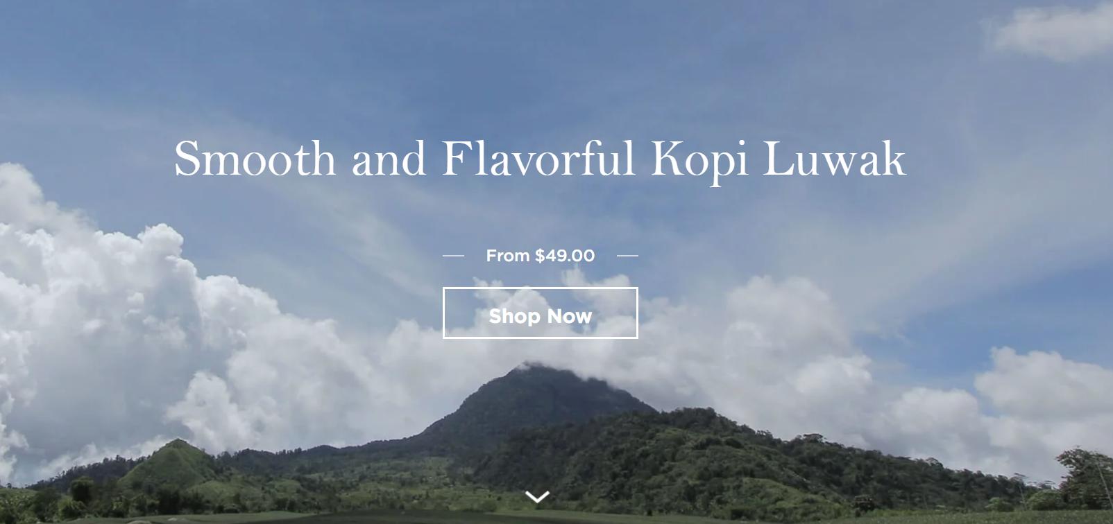
Kopi Luwak Direct pretty much perfected this. Their homepage features a really short value proposition, followed by the price and the “Shop Now” CTA button inviting you to purchase their Kopi Luwak coffee selection. This leaves very little room for the visitor to get distracted, as the CTA urges them to take action right away, while they are at their most engaged.
Conclusion
Keeping your audience on your website and having their attention is a key step toward getting them to convert into customers. Start implementing the tips we’ve shared and you’ll improve the elements that directly influence visitor engagement in no time. Good luck!