Hipsters often get a bad name, but what does the term actually mean? Well, according to the dictionary, a hipster is simply someone who keeps up with common trends. They’re not all teenagers wearing baggy pants, cigarettes dangling from their lips and a Starbucks cup in their hand (though who doesn’t love a Starbucks anyway?) When it comes to web design, it’s definitely not a bad thing to follow the footsteps of the hipsters of the world. They know exactly where it’s at – after all, they’re experts on trend. They know exactly what appeals to their target audience, and they know when it’s time for a brand new look. Websites don’t have full transformations often, but when they do, you can bet they’re trying to keep up with the latest trends. So what’s trendy at the moment in web design? Consider this your guide to keeping up with the latest fashions and hipster web design trends.
Think futuristic by incorporating virtual reality and 360 videos
It may seem like a very fiddly technical addition to a website, but it’s certainly an original one. Everyone is obsessed with virtual reality these days. It’s often used for gaming, but now that Google has created their virtual reality headset, Daydream, we can expect to see a rise in VR in website designs. 360 videos often crop up on Facebook newsfeeds and are great as clickbait, but they’re being seen more widely now in web design for an immersive experience. Virtual reality is becoming much more popular, even to the point where it is being used in the workplace.
Hipsters use plenty of color and images to capture the eye
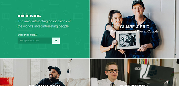
When it comes to making a website, it’s hard finding the balance between a readable, easy to use the site and making it stand out from the crowd. Too much happening on the page distracts from what your message is. Too little, and people will begin to lose interest. On sites like WordPress, some of the most popular ‘themes’ are often photo-based. With a grid layout, a header image can be used that appears at the top of the article, and also on the home page to encourage someone to click on the content. Minimums use a grid layout to keep their images undisturbed by too much action, and each image leads on to an article. These are great features for sites based on photography, fashion, food, and travel because often, images are needed to compel a reader to read articles on those topics. For example, a picture of a good looking cake would inspire someone to look at the recipe.
Sometimes, a more minimalist approach is necessary
When it comes to more serious web topics, it might be tempting to dull the color down and give a ‘let’s get down to business’ vibe. However, with so much content on the internet now, it’s important to choose a web design that attracts the eye. If you do opt for duller colors, take minimalism to the next level, taking inspiration from award-winning sites like ETQ Amsterdam and MIKIYA KOBAYASHI. The clean finish is satisfying to look at and keeps the content at the heart of importance.
Keeping up with modern trends often means looking at what young adults like
Millennials never stop for a second, so to attract a young audience, your website shouldn’t stop moving either. People need to see progress, excitement and fast motion on your site. Use GIFs to appeal to a younger audience, and also to keep your site looking active. Don’t overuse GIFS, and make them significant to your site – professionals use them sparingly, but with good purposes, such as to highlight important products, or in advertisement. If you’re using Wix as your CMS, you can utilize parallax scrolling for fun effect, and cinemagraphs for a more subtle effect than GIFS. Each site you try out will have different perks, and it depends on how much time you’re willing to put into your design, but these features give your site a more polished look. Sites such as Feed Music use these features so you can see them in action.
High-quality stock photos are the way forwards
A site that uses bad stock photos is laughable. Make sure that when you’re using stock images, they’re relevant and of good quality. It’s best if you can also try and link the photographs in some way, to create a color scheme or a strong aesthetic. For example, using photographs all the way through the article and then adding a cartoon at the end looks unprofessional, unfinished and off topic. A true hipster blog will be filled with colorful photographs, all of the same style and using a similar type of model if people are involved. There won’t be loads of crazy effects or sepia tones on the photographs – unless, for whatever reason, that’s important to the images. They will be taken with a good camera, and be clear and simple so as not to attack the reader’s eyes.
Don’t be under the illusion that pre-built websites are a cop-out
You may be determined to create your own site from scratch, but unless you’re a web design expert, the chances are it’s all going to end in tears. The best way forward is using a pre-built site such as WordPress or Wix. All you have to do is add the content, move your ‘themes’ around a little and get your site looking pretty. This gives you time to focus on the content you want to get across, rather than faffing around with the design. It may seem like a cop out, but it’s actually how most people get off the ground. It’s easy and accessible, so it’s the best place to start. Remember, you can always get a professional web design agency like Ramotion in later to help out as your business or blog grows in popularity.
Plug-ins are an easy way to keep your site modern
Plug-ins can be mobile phone friendly, and keep your site from just being a static page. It makes the experience interactive and more inclusive with your readers. Sites such as WordPress allow you to add them easily to your site, and often at no or little cost on your part. They can be added at any time, so once you grow confidence in customizing your site, a plug-in is one of the first things you should consider adding.
A strong website identity makes people remember your name
No one will remember a blank page with boring content – except maybe as the most boring site they’ve ever come across. You must create a positive brand representation, and that starts with a brand identity. Websites have logos to make them stand out or color schemes. When you think of Facebook, you can immediately picture that dark blue header and the white F on the logo. What do you want people to see when they picture your site? Something exciting and unique, one would hope! Take inspiration from your favorite sites – what is their logo like? What images do they have on their home page? How do colors affect the mood of the site? These can seem like obvious things to keep in mind when creating a website, but since it’s one of the most important parts of web design, it’s necessary to mention it.
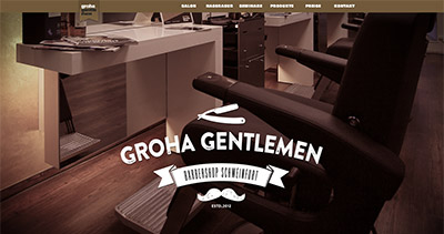
Take Groha Gentlemen, for example. The logo is distinctive with the mustache incorporated under the banner, and though the color scheme is dulled, it makes the logo stand out more.
How to keep up with hipster web design trends – make your own trends
Trends only start through innovative thinking and creative design. If you really want to reach the top, you need to make your own design pop. You can follow the crowd, or take it one step further and surpass the crowd. Lead the crowd somewhere new – you have it in you to create a site that will appeal to the masses. You just have to be willing to put in the work, and you’ll have an eye-catching site in no time. Take a look at some of our best blogger templates to get some ideas for an original design.
My name is Irina, I am a certified specialist in advertising and public relations, journalist. For over two years I have specialized in design issues in various fields (interior design, web design, graphic design).
My Blog: Designdroide.com
